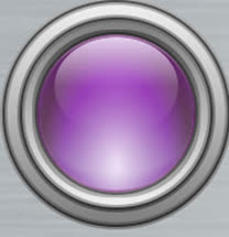
Changing colors is surprisingly difficult and time consuming as each layer interacts with all other layers to produce the final image so it ends up being a lengthy process of successive iterative approximations to fine tune the color to make it actually look like a lit up LED. Here are two different color versions of he MK I button, I've yet to successfully change the color of the MK II button as it has many more layers. Still working on that.
This was the first cut at in in CSS. It's ok, but the jaggies do have to go. Here it is compared to the original bitmap image. Notice the middle is fine, it scales well to any size with no pixelation, but the surrounding bezel is horrid and needs to be smoothed out. So we anti-alias with the conic sections which we can fake with elliptical radial gradients which are new to CSS3.
Radial anti-aliasing added. I'm happy with this one. Here it is zoomed up below, so you can see the annular rings that comprise the anti-aliasing. They're matched to the gradients of the bezel. Note the lack of jagged lines in the bezel rings.
All the shading, gradients and positioning are done by hand. It was a nightmare.
I found this in a collection of 3D buttons along with numerous others and used it for a while in this form, but I always wanted to have a CSS version instead of a bitmap image. But until te CSS3 feature radial-gradient worked properly everywhere this was not possible. Now it is...